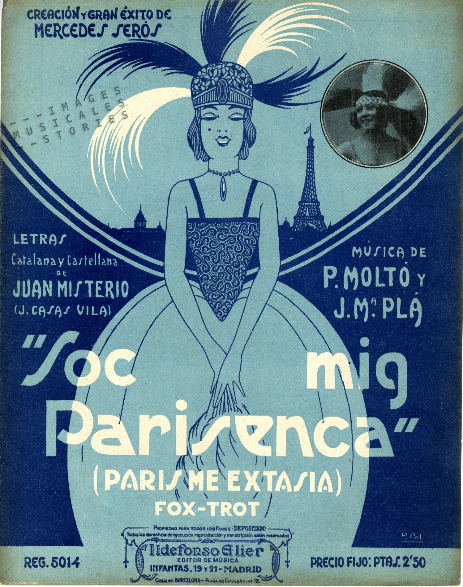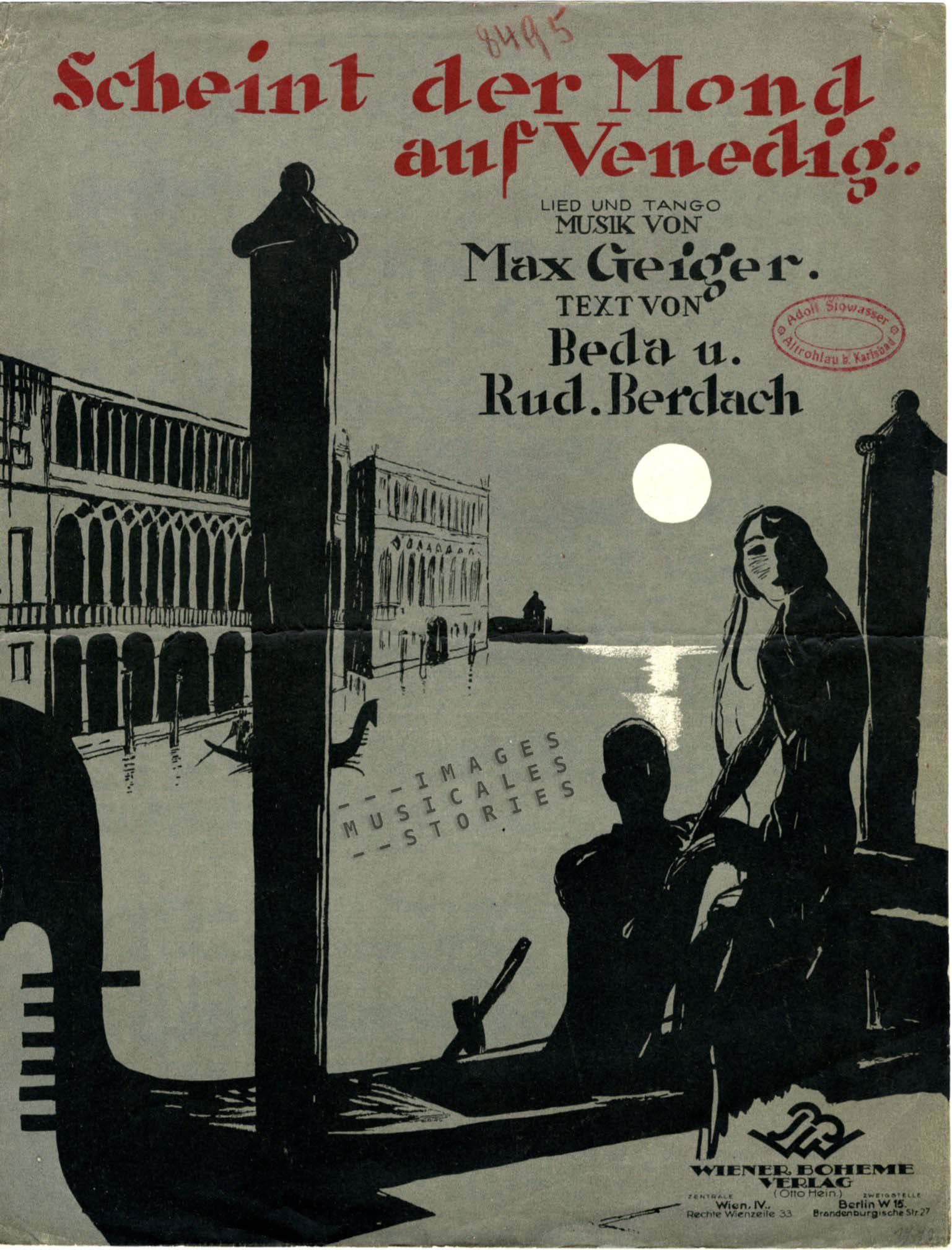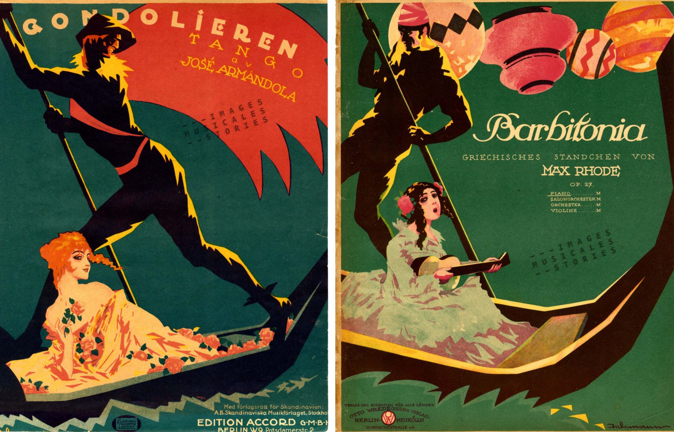
The French painter F. Hugo d’Alesi (1849 – 1906) was born as Frédéric Alexianu in Transylvania. Although he originally trained as an engineer, he was best known for his large number of imaginative and brightly coloured travel posters for railway companies at the end of the 19th century. He also illustrated sheet music, mostly in the 1880-1890s.
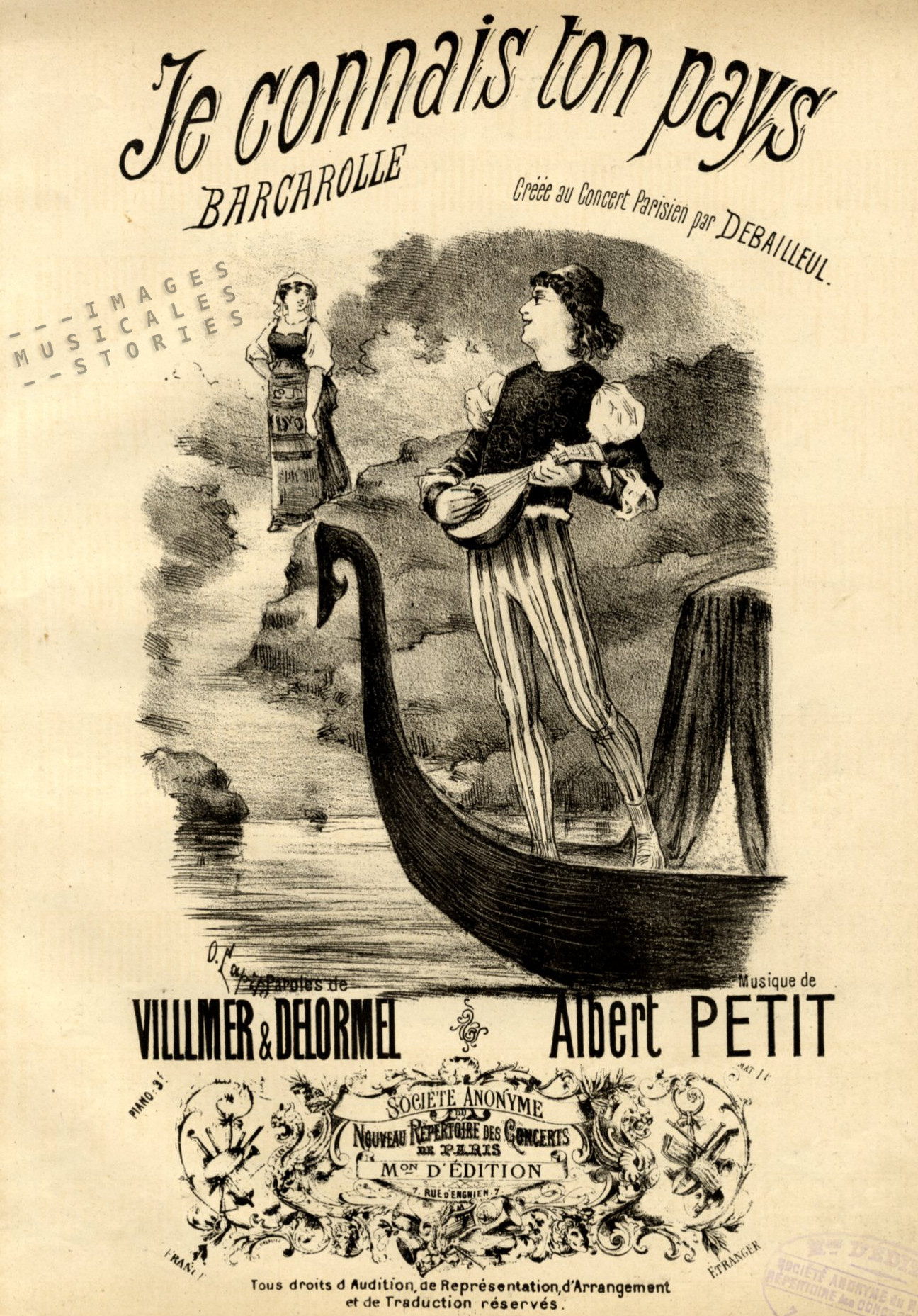
Almost forgotten is his creation of one of the first amusement attractions that triggered all senses of the spectators: the Maréorama. Olivier Castel, who previously diverted us with Venetian gondola prows, will embark with you on this fascinating journey.
The Maréorama was one of the flagship attractions at the 1900 Paris Exposition. Maréorama simply means sea panorama. It faithfully reproduced the deck of a steamer, pitching and rolling while crossing the Mediterranean Sea.

Apart from the movement of the ‘ship’, other effects ensured the illusion of a sea trip: there was the sound of rain or thunder, mist, iodized and saline sea breezes that blew over the deck, undulating ‘waves’ of blue cloth all around, special lighting for creating night- and daytime atmospheres, and even the odour of seaweed. All this made the Maréorama the first ‘4D’ attraction ever. For the price of a cab ride, the seven hundred passengers embarked on a fast-track cruise that promised the same sensations as from an actual voyage on the Mediterranean. At that time travelling was a privilege for the aristocracy and the emerging high bourgeoisie. With the Maréorama almost everyone could now afford an exotic boat trip.

The moving platform of the ship (30 metres long and 9 metres wide) rested on a pivot supported by four hydraulic pistons which imitated the motion of the sea. After the ‘trip’ visitors could go downstairs to admire the imposing machinery.
For the record, “maréo” also means “seasick” in Spanish …

The Maréorama was built in a large palace located in the amusement section of the World Fair on the Champ-de-Mars next to the Eiffel Tower, itself a reminder of the previous exposition in 1889.

While on board ‘passengers’ could send postcards from the Maréorama, just as if they had actually sailed the Mediterranean Sea. The ‘sea trip’ departed from Villefranche-sur-Mer, a commune on the French Riviera near the French-Italian border. As soon as the siren of the ‘ship’ sounded the departure signal, two immense canvasses of 825 meters long and 15 meters high started to unfold simultaneously on either side of the ship. Each of the two canvasses was attached to two huge rollers driven by hydraulic motors on either side of the ‘ship’. The upper edge of the canvas was hooked to a rail and reinforced to prevent sagging.
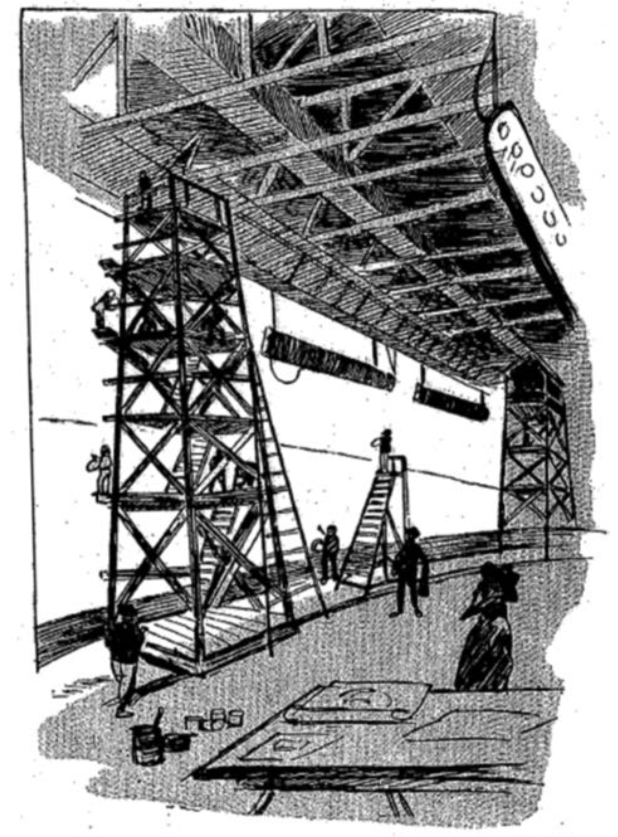
Hugo d´Alési himself created the views of the different cities. He had spent a year travelling to draw all the stages of this journey on a series of notebooks. On his return, he hired ten painters to reproduce the landscapes on the canvasses.
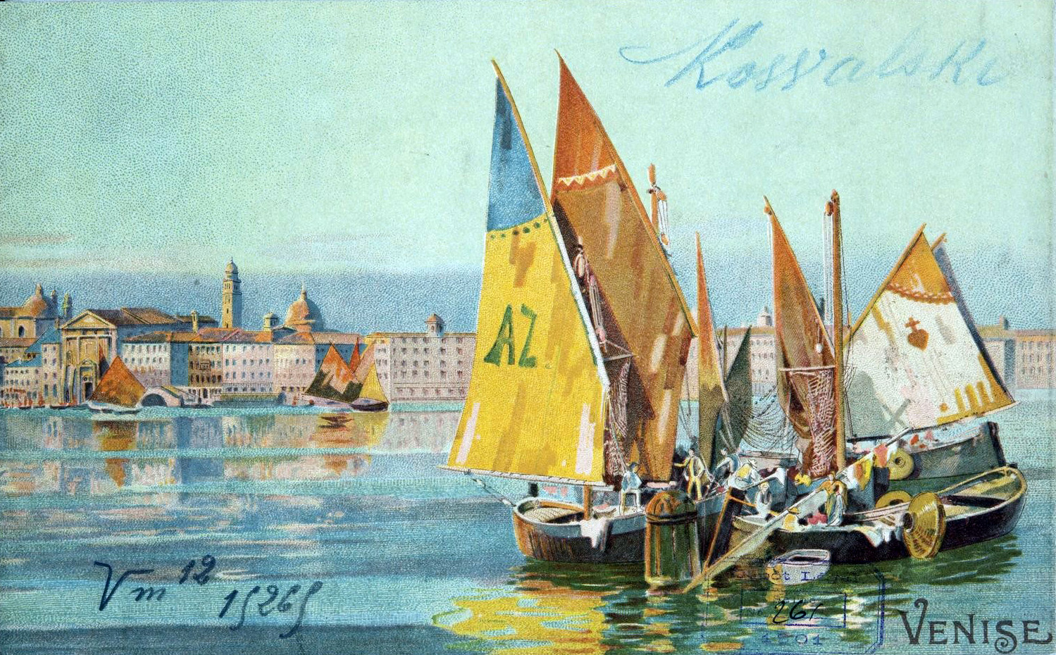
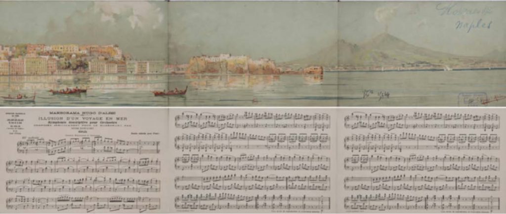
After about half an hour, the ‘ship’ made its first stopover in Sousse on the Tunisian shore, then left for Naples and arrived in Venice by ‘nightfall’. Leaving the peaceful Venetian lagoon the ship soon was caught in a terrifying storm but safely reached its final destination, Constantinople, at the crack of dawn. For the following session, the canvasses were then unrolled back to their starting point, and thus showing the return trip from Constantinople to Villefranche.
Actors and dancers complemented the nautical experience, portraying deck hands, the captain and his officers, pirates or indigenous people. Folk dancers performed a tarantella in Naples or a belly dance in Constantinople.
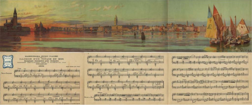
To heighten the sensorial experience during the trip Hugo d’Alesi had asked the eminent Henri Kowalski to compose a symphony: Illusion d’un voyage en mer. The orchestra was hidden below the deck and directed by the composer himself. It was a work in four parts: Sousse, Naples, Venice and En vue de Constantinople.
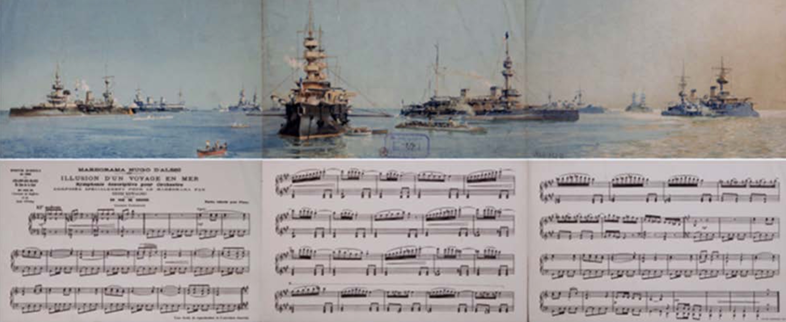
The score was adapted in 1901 by Victor de Courmont for piano solo, and then illustrated with lithographs by d’Alési. With his drawings of the French vessels anchored in the harbour of Sousse —accompanied by a the firing of a salvo and the Marseillaise— Hugo d’Alési clearly wanted to emphasize that Tunisia was part of the French colonial empire.
Alas, the story of the Maréorama ended sadly. Normally, it was to stay put for a year after the end of the exhibition, and then even make a tour of the world. But despite the undeniable public success of the attraction, the company Maréorama – Hugo d´Alési went bankrupt as early as December 1900. The shareholders of the company sued him for reimbursement of the subscribed capital. Their claim was dismissed by the court.
Olivier Castel