Olivier Castel is one of our long-time readers. He teaches medicine at the university of Poitiers (France) and has been for many years a passionate collector of books and sheet music about Venice. It pleases us very much to publish his interesting findings on the iconography of gondolas. We hope that our translation does justice to Dr Castel’s fine observations. Happy reading!
The image of Venice is closely associated with its gondolas, slowly and gracefully gliding through the shallow, narrow canals of the lagoon. With their elegant, easily recognisable profile and black colour they have become a key symbol of the city. It is therefore not surprising that they have been a source of inspiration for many artists to illustrate sheet music depicting Venice. The city’s captivating charm has spawned a remarkable number of at least 350 scores with a French title or published in Paris — a third of them illustrated with a gondola.
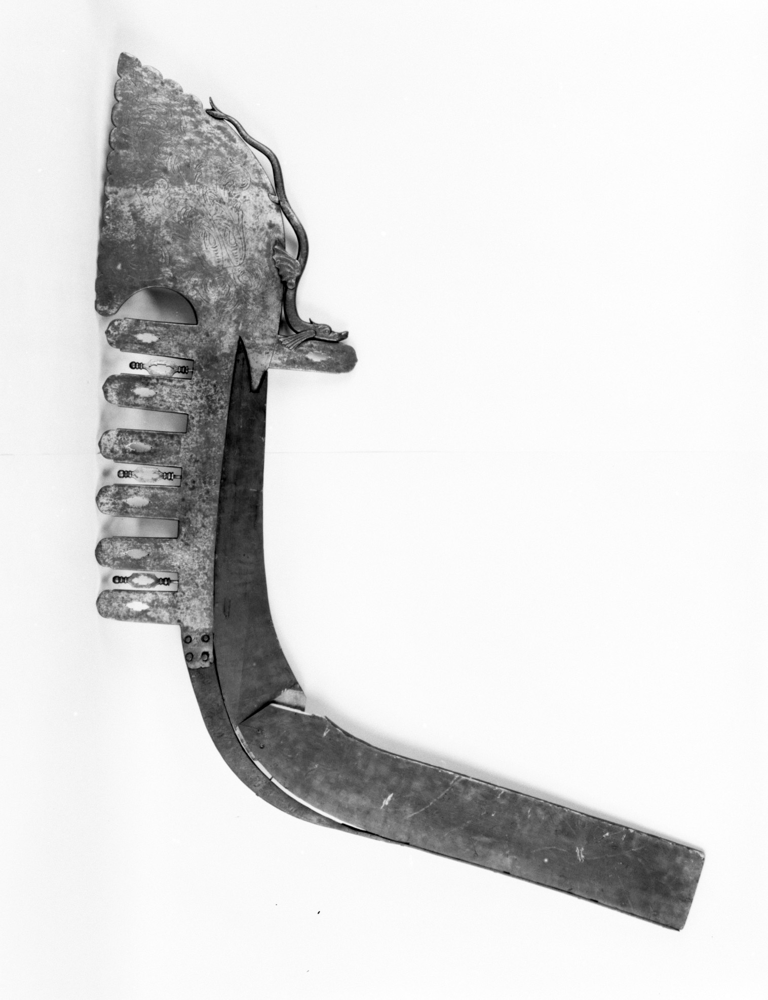
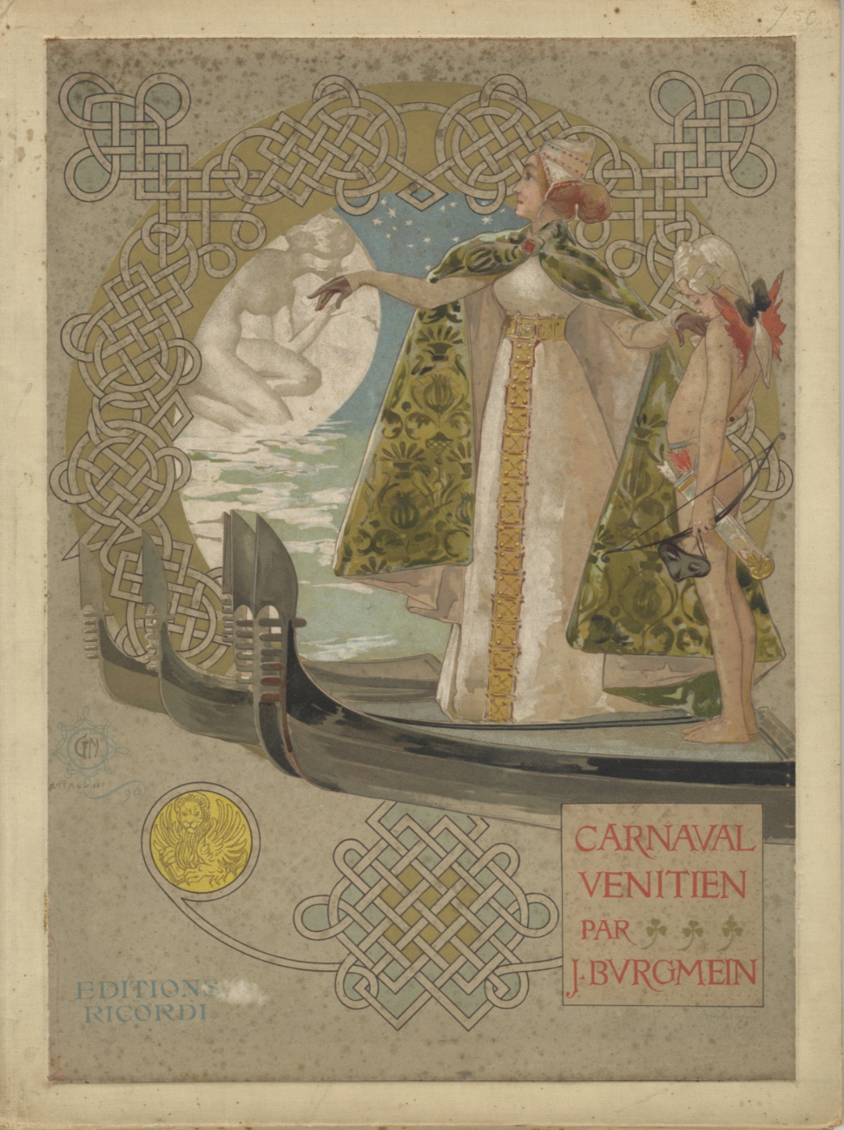
Very early in its history, the bow of the gondola was adorned with a characteristic fero da prova. This iron prow head forms a comb with six teeth rising forward. It was originally used to counterbalance the weight of the gondolier. During the XVIIth century, each element acquired a precise meaning: the curvature represents the Grand Canal, the 6 parallel horizontal teeth at the front represent the 6 sestieri or districts of Venice and the only tooth opposite the upper tooth, represents the island of Giudecca. Finally, the empty space formed by the converging of the upper curved figure (called the Doge’s hat) towards the first tooth represents the Rialto Bridge.
French sheet music seldom gives an accurate representation of the gondola’s bow and iron. The Italians knew better of course, as proven by the opening image of ‘Carnaval vénitien‘ published by Ricordi, and richly illustrated by the Italian artist Giovanni Maria Mataloni (1889-1944). Mataloni is best known as a poster artist, and one of the precursors of the Stile Liberty, the Italian variant of Art Nouveau.

Marie-Alexandre Alophe (1812-1883), aka Adolphe Menut, is a painter and a lithographer. His work is characterised by a gentle sensitivity. Although also a photographer, he does not care about an accurate depiction, only the general appearance matters for him in order to evoke Venice. Let’s look at his 1829 drawing for Le Doux Air de Venise, a typical illustration for early 19th century scores. The prow iron is absent, its shape is ‘integrated’ in the wood of the gondola, the proportions are wrong, the front teeth are too thick and there are only three of them with no rear one. The result is a heavy, coarse bow.
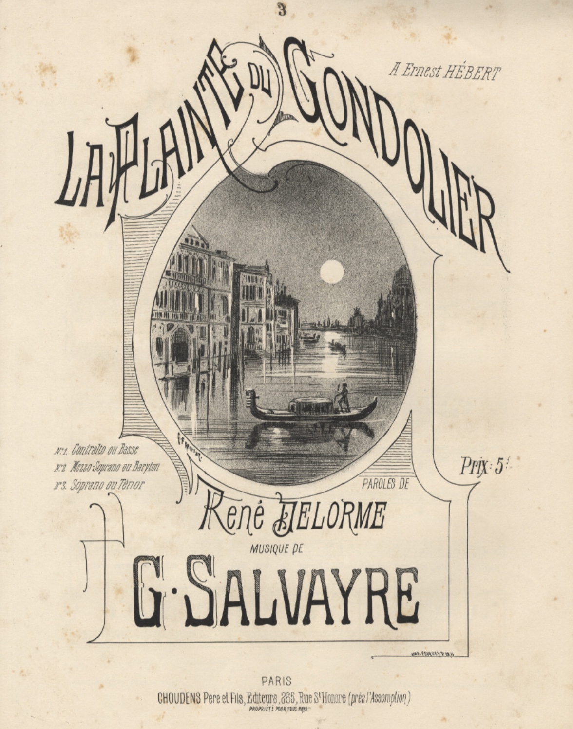
The same applies to the cover illustration of ‘La plainte du Gondolier‘ by Gustave Fraipont half a century later. Fraipont (1843-1923), a French illustrator and poster artist of Belgian origin, here at the beginning of his career, gives us an airy stereotypical vision of Venice and its Grand Canal but with a rather unrefined gondola.
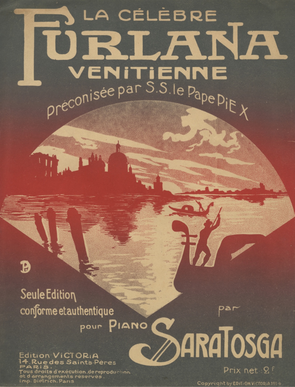
During the 1914 Furlana dance craze Paul Dubois (1886-1949) illustrated two covers of La Célèbre Furlana Venitienne. The illustrator, identified by the monogram PD, creates one of the most curious representations of the Venetian gondola, with an unrealistic prow-head where the artist didn’t respect the Grand-Canal curvature, nor the number of teeth both at the front and at the rear. He even placed the gondolier opposite his usual place. Besides, knowing that the gondola has an asymmetrical shape, it would be impossible to move it through the water.
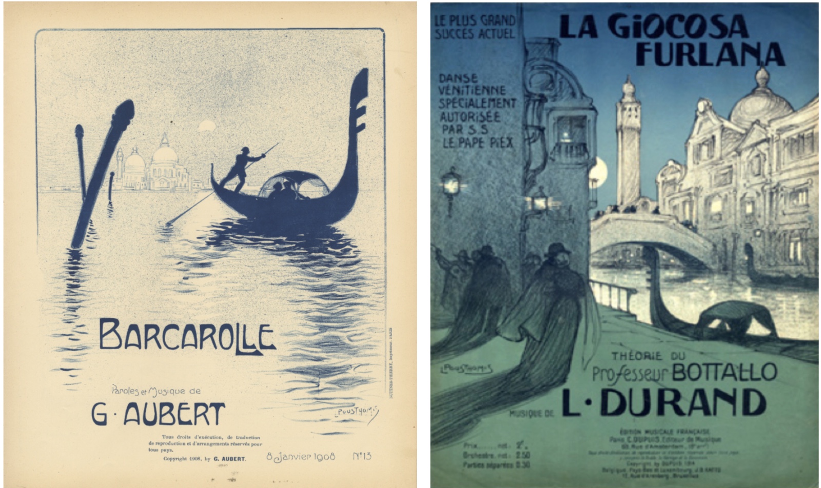
Leon Pousthomis (1881-1916) created many sheet music covers during his short life (he died in the Battle of Verdun at the age of 35). The 12 illustrated scores depicting Venice are evidence of his prolificacy. What characterises his vision of Venice perhaps the most is the distortion of the bow of the gondolas which he stretches to the extreme.
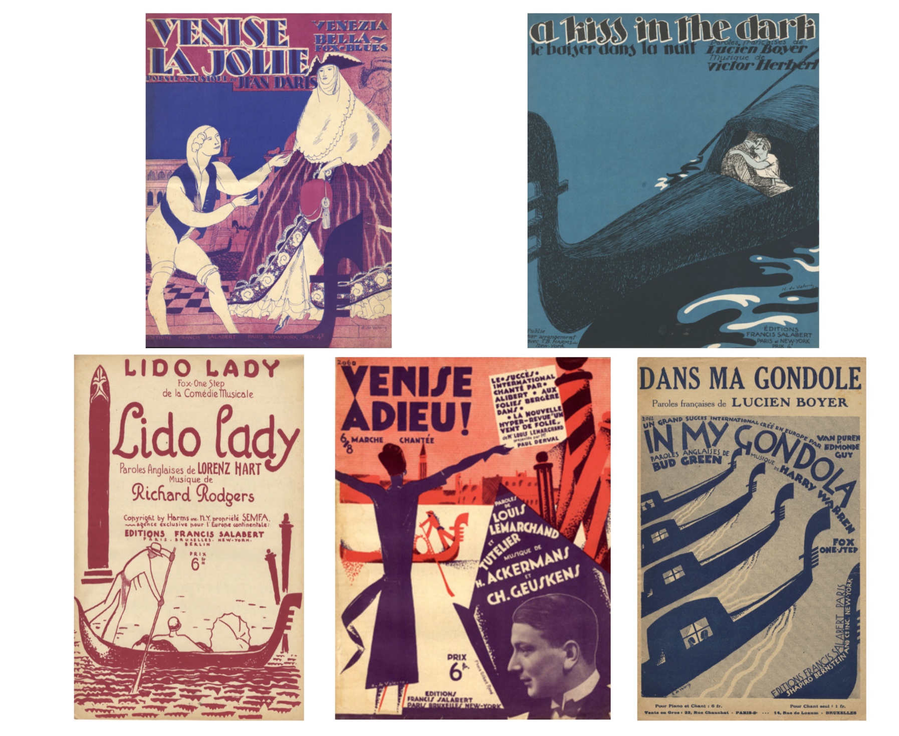
Roger de Valério (1886-1951) created his first cover for the publisher Salabert in 1917, for whom he allegedly produced more than 2000. In 1926 Emile Chéronnet wrote: “I had this collection in my hands. This is a set of such a baffling variety that you can hardly believe it is not made by an entire studio. However Valério works alone indeed, and for these musical illustrations he has an imagination that is nearly miraculous” (L’Art Vivant, October 1926). It is therefore not surprising to find no less than 11 of his covers depicting Venice, including 5 with a gondola.
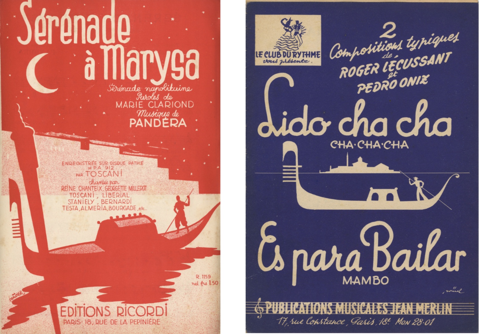
But it is Würth who illustrated the most scores with Venice on the cover: 16 between 1920 and 1961. He gave the gondolas a simple shape with an elongated, stylised bow and a marked Rialto Bridge. He purified his design over the years as we can see on these two sheet music covers made 25 years apart. Würth was an ubiquitous illustrator in French music publishing in the mid-twentieth century. He has worked for a large number of publishing houses (the 16 recorded scores were published by 15 different publishing houses). Despite a plethora of work, nothing is known about his life, which is rather surprising but not unusual in the world of music publishing.
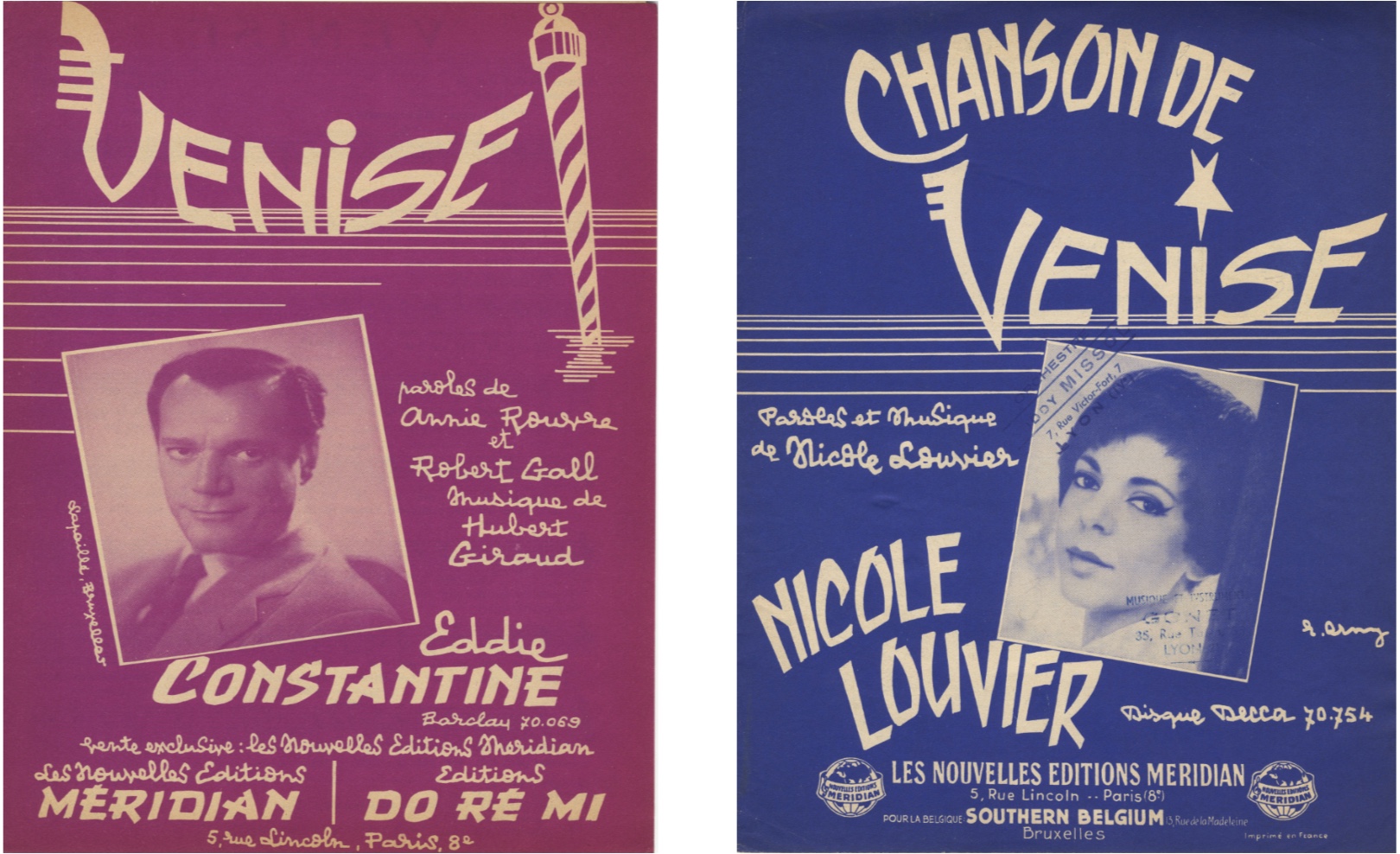
To conclude this post on the ornamental prow iron we emphasise its importance as an icon for Venice, a simplified version of it being enough to evoke the city. For the 1957 song ‘Venise‘ Raymond Erny replaced a bar of the V by the highly stylised prow of a gondola. He also uses a Palina, another symbol of the city. For the 1961 song Chanson de Venise, he simplifies the prow even more by merely adding three horizontal crossbars to the front of the V. Erny, a contemporary of Würth, also remains to this day almost unknown, despite an equally significant production. Fortunately, we still have their illustrations as reminders of their work.
Olivier Castel